AliExpress App Redesign
Case Overview
Project brief
Analyse a mobile UI from behavioural lens and suggest a redesign that promotes more sustainable and ethical behaviours.
Redesign Goal
To identify overconsumption design nudges and propose a redesign which would promote more sustainable consumption customer behaviours.
About AliExpress
Founded in 2010, AliExpress is an online retail service based in China and owned by the Alibaba Group.
used in 190+
countries
300 million
monthly visits
150 million
buyers
600 million
downloads
Methods used
My role
- • conducting user testing
- • high fidelity prototype iteration
Project duration
1.5 months
UI Teardown
Journey and behavioural analysis
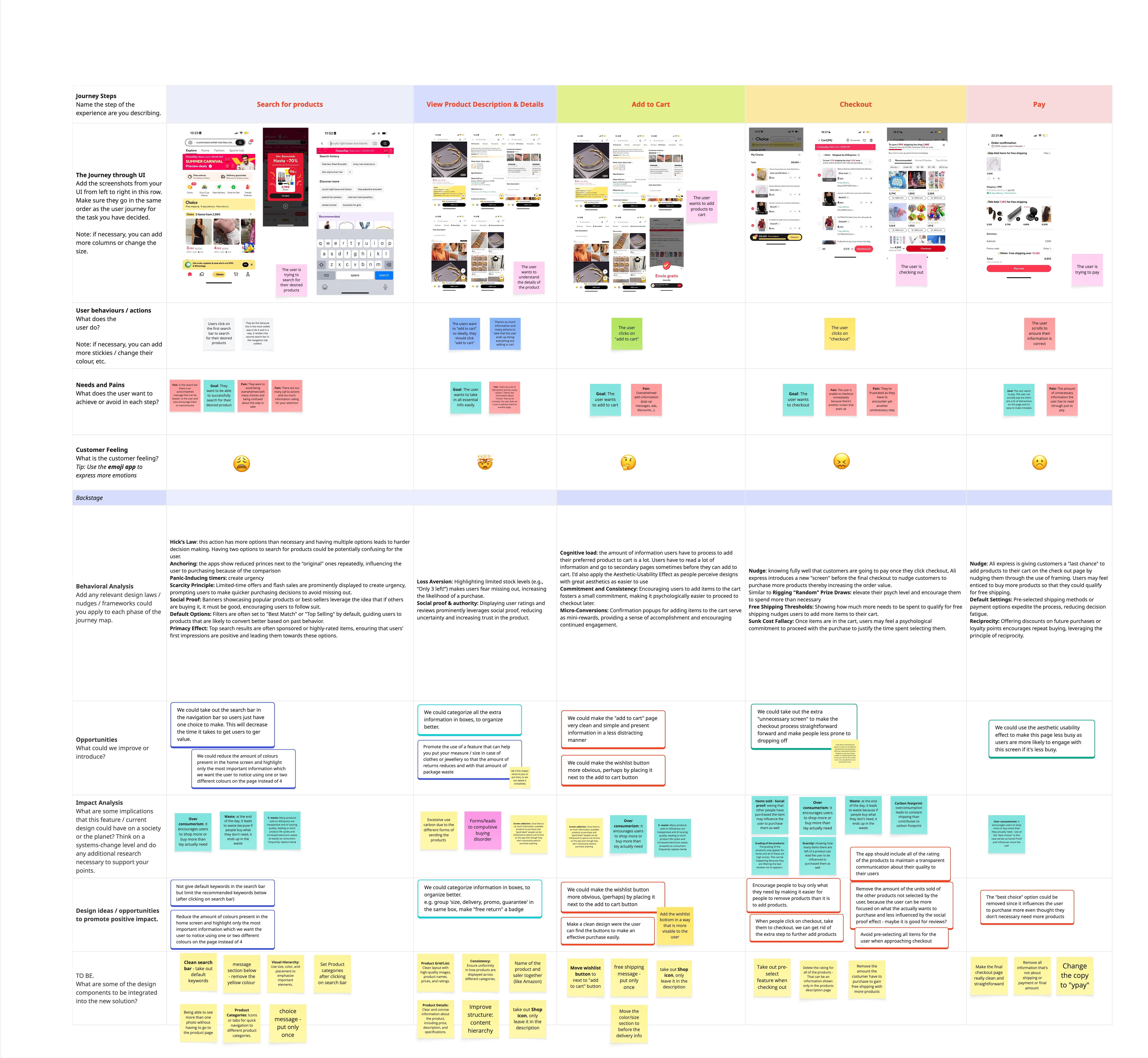
The AliExpress purchase journey was mapped from product search through payment, identifying user actions, needs, pain points, emotions, behavioural nudges, and opportunities for a more sustainable redesign.
Key focus areas
- •How search, recommendations, and urgency cues influence product discovery.
- •Where cognitive load and dark patterns appear in add-to-cart and checkout flows.
- •Which opportunities could reduce impulse buying and improve decision clarity.
UI Teardown Board
Scroll inside the board to inspect the journey map, behavioural analysis, opportunities, impact analysis, and design ideas at a readable size.
User Journey
Step 1: Search for products
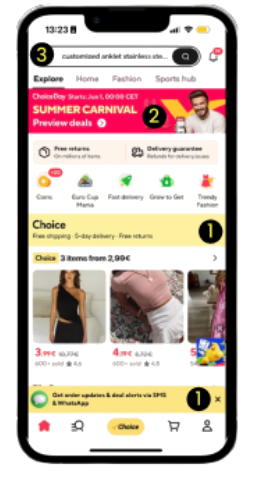
Action: User clicks on search bar to search
- 1
Cognitive Overload: many options on the home page cause users to struggle to process all the information, leading to decision paralysis
- 2
Scarcity principle: promotion ads and countdowns create a sense of urgency to avoid missing out
- 3
Priming: autocompleted keyword search bar influences users to think about that item or category, leading to overconsumption
Step 2: View Product Description
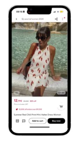
Action: User clicks on the selected product and views details
- 1
Cognitive Overload: clutter of information leads to decision fatigue and confusion, leading to decision paralysis
- 2
Anchoring: persuasive messaging creates the perception of a great deal or bargain
- 3
Choice Architecture: with upselling and cross-selling techniques, recommended products are strategically placed to influence decisions leading to overconsumption
Step 3: Add to Cart
Action: User clicks on the Add to Cart button
- 1
Default Bias: due to its visibility, users are nudged towards add to cart without considering alternatives like wish list, causing an inability to delay decision-making and leading to impulsive buying
- 2
Hick's Law: many redundant steps in the buying process increase cognitive load and decision-making time with each additional step
Step 4: Checkout
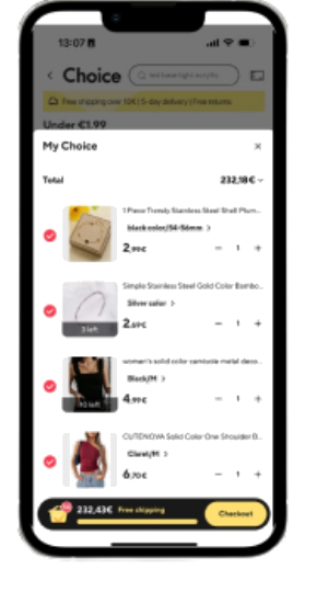
Action: User goes to Cart
- 1
Default Setting: all the products in the cart are automatically pre-selected for checkout, which may lead to unintended purchases and overspending
- 2
Sunk Cost Fallacy: users may feel a psychological commitment to proceed with the purchase to justify the time spent adding to cart
- 3
Loss aversion: AliExpress taps into users' aversion to losing money on shipping fees, leading to spending more
Step 5: Paying
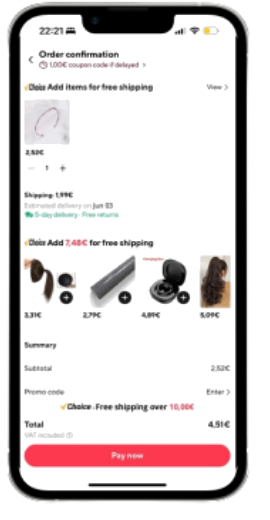
Action: User clicks on the Checkout button
- 1
Nudge: Upselling and cross-selling biases nudge customers to purchase more products, thereby increasing the order value, leading to overconsumption and overspending.
Problem statement
Screen overpopulation with products, endless scrolling, pop-up ads with discounted or extra offered products and the inability to delay decision-making lead to excessive buying, overspending and overall overconsumption, which negatively influences both the buyer and the environment.
To better understand our user persona, their needs and set our project goals, we decided to use EAST model.
Goals
- 1
Make the shopping journey effortless
- 2
Make the user experience visually appealing
- 3
Make reduced consumption the easier option
- 4
Make it more enjoyable for users to explore products and make purchases
Developing phase
Prototyping & Testing
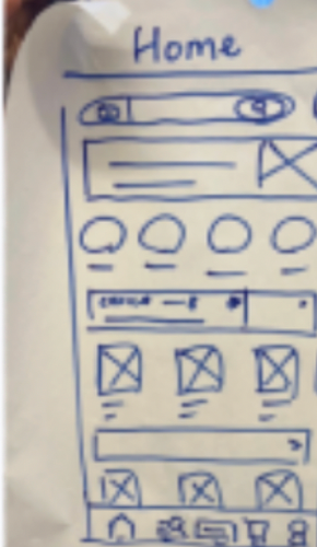
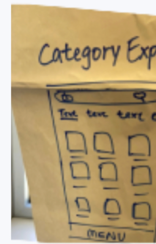
Low fidelity sketches
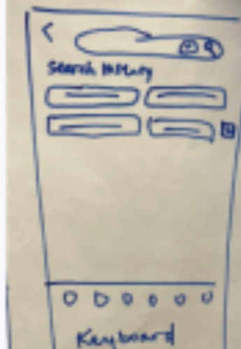
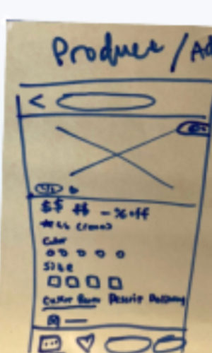
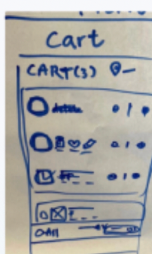
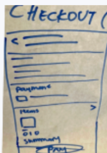
User testing key takeaways
To validate our app redesign, we conducted user testing with 10 participants.
Key feedback
What worked well?
“Cleaner page, makes it easier to digest information.”
“Accessible wish-list feature, making it easier to organise products.”
“It's better organised & easier to navigate.”
Even better if...
“The promotion banner on the homepage is reduced.”
“The product page is less confusing and cramped.”
High fidelity prototypes v.1
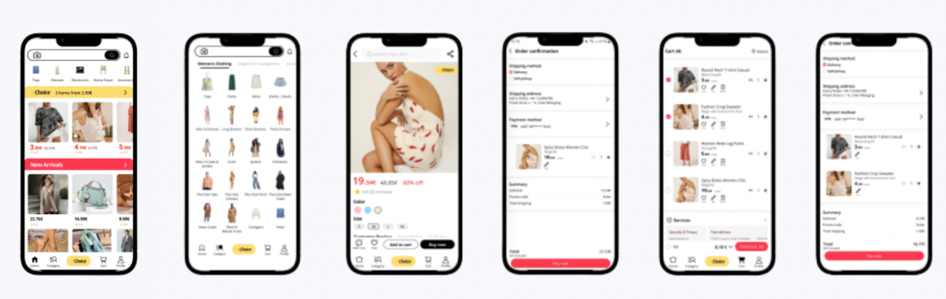
Final design response
Final App Redesign
Instead of placing long notes under every screen, each comparison shows the behavioural nudges found in the original flow and the specific design response used to reduce overconsumption.
Home Page
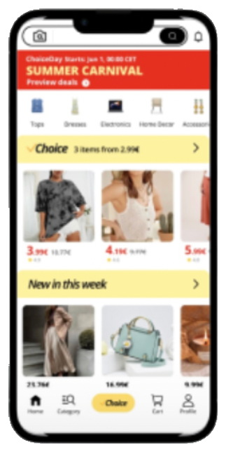
A loud countdown banner and dense product grid pushed impulse purchases before users could orient themselves.
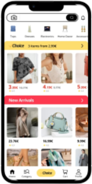
The promotion banner is toned down and the grid is spaced out, letting users browse deliberately instead of reacting to urgency.
Search for Products
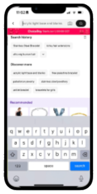
Search suggestions and recommendations pushed users toward more options before they had chosen a clear direction.
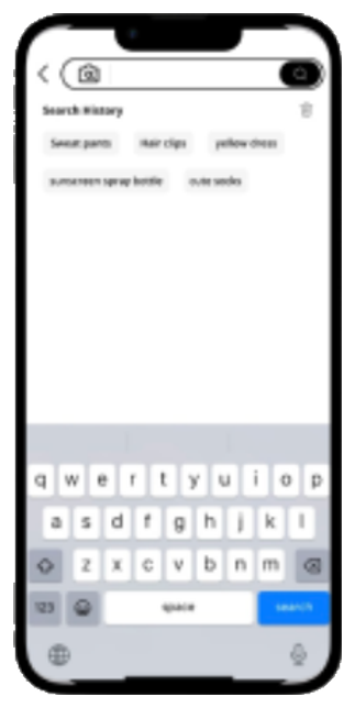
Search is simplified around recent intent and relevant categories, making product discovery more deliberate.
Category Browsing
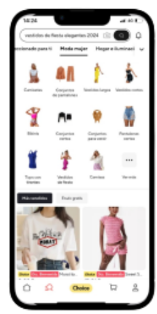
Broad category pages mixed many unrelated options, making it easier to keep browsing instead of choosing intentionally.
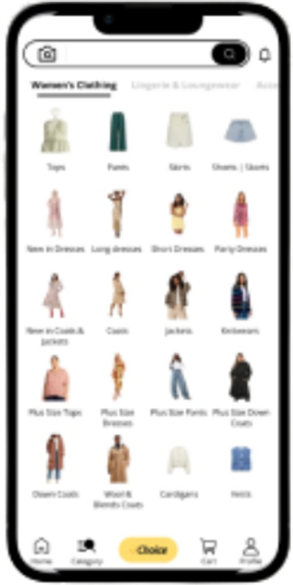
The redesign narrows the category view to options that match the selected intent, reducing unnecessary browsing loops.
Product Description

Discounts, recommendations, and scattered details made the product page harder to evaluate calmly.

Important information is grouped clearly, with wishlist access supporting delayed and more thoughtful decisions.
Add to Cart
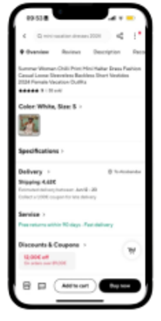
The buying flow added extra steps and nudged users toward quick cart commitment.
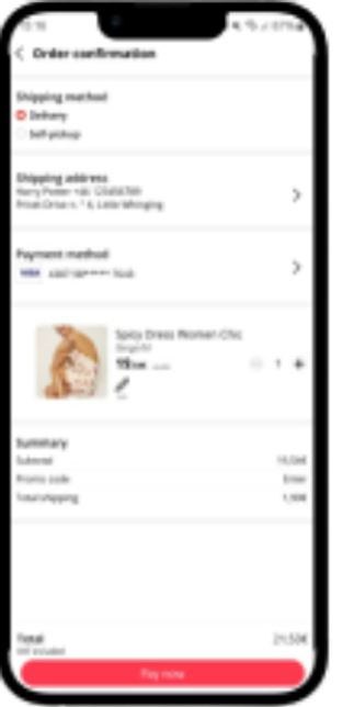
The redesigned flow confirms the action clearly without adding distracting offers or extra decisions.
Cart
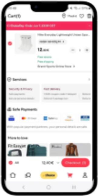
Pre-selected items and free-shipping prompts encouraged users to keep more products in the cart.
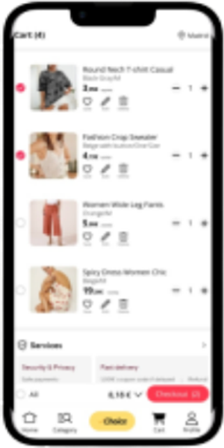
Users choose what to check out themselves, reducing accidental purchases and overspending pressure.
Checkout
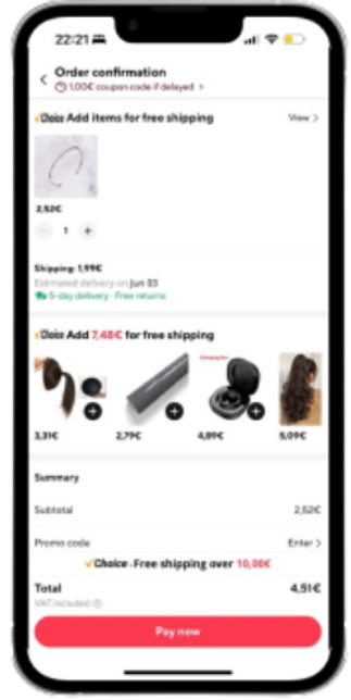
Extra product prompts appeared close to payment, encouraging last-minute additions.
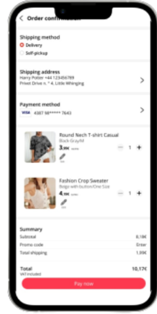
Checkout focuses on confirming the selected items, helping users complete only the purchase they intended.
Conclusion
Reducing impulse buying through clearer choices
The redesign aims to create a more streamlined, user-friendly interface where products are easier to find without unnecessary distractions.
By removing pressure points such as pre-selected checkout items, late-stage promotions, and cluttered recommendations, users can make more thoughtful buying decisions and avoid unintended overconsumption.